7 Unique and Engaging Careers Pages To Inspire Your Recruitment Marketing
From highlighting office culture to showcasing company values, your careers page is your chance to share everything your company has to offer. And with the careers page ranking as the No. 1 source of information for entry-level candidates researching a company, it’s more important than ever to create a page that will engage and educate candidates as they begin the application process.
As a new year approaches, it’s a great time to re-evaluate your recruitment marketing materials – especially your careers page. Would your careers page benefit from more video content? A section dedicated entirely to your career development opportunities? Information on your typical application process and timeline?
When brainstorming new ideas for your own recruitment marketing, it can be helpful to take a step back and check out how various recruitment teams tackle employer branding. To help with that, we’ve rounded up seven careers pages that do a great job conveying a company's mission, values, office culture, early-career opportunities, and anything else that makes them unique. Check them out below.
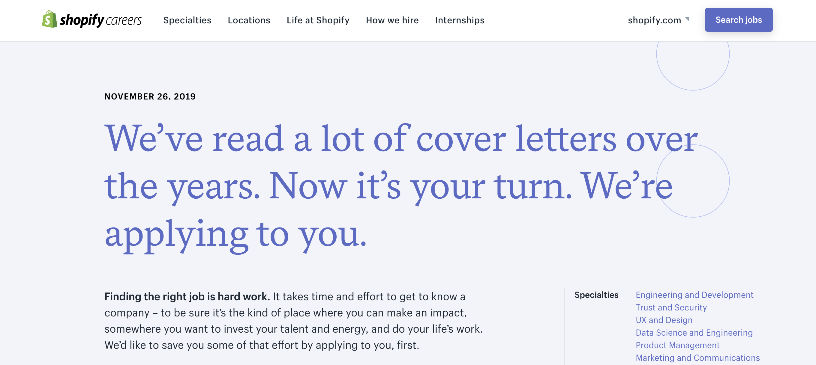
Shopify took a creative approach to their careers page by flipping the narrative. Instead of candidates reading through their website and then applying to their open positions, they wanted to apply to candidates first. They turned their careers page into a resume, highlighting the company’s experience, skills, and achievements – complete with two references.
Their recruitment video is upbeat, inclusive, and seems to speak straight to growth-oriented candidates with the sentiment, “You don’t need to be the best, but you need to be determined to become the best.” They emphasize how employees can grow within their company with opportunities available for personal development, professional development, and experimentation. They also lay out their entire hiring process so candidates can feel adequately prepared for the process. On their main page and internship page they have a detailed set of FAQs that help inform candidates as well.
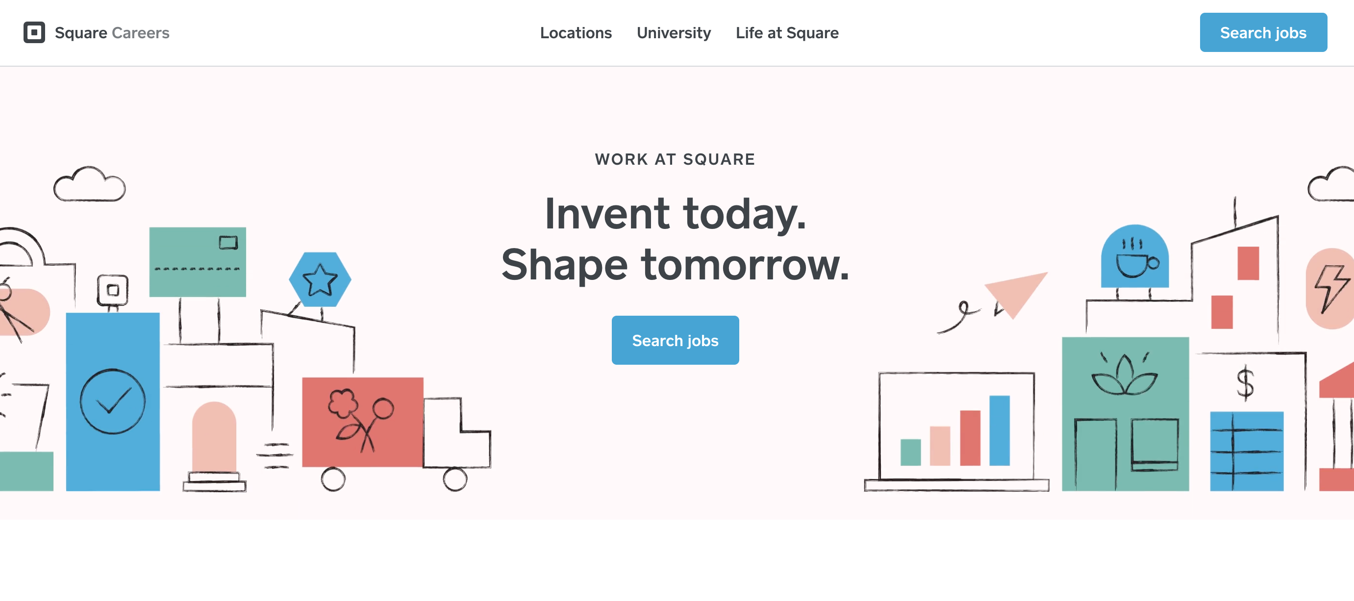
This financial service company not only has a clear and useful career page, but also an informative page specifically for university students/recent grads. Their main career page starts out by highlighting their company values and a wide array of perks, including competitive compensation and learning and development programs. A carousel of photos also showcases their diverse team and gives an inside look into the office’s activities. Before you reach the current openings at the bottom of the page, they emphasize their company’s mission and link to a description of how the company began, a useful bit of information for candidates’ research. They have an array of customer photos to highlight their commitment to helping small businesses, which is especially useful for attracting Gen Z candidates who value that kind of social initiative. Their recent grad and intern page goes over the opportunities available for people that age and also some FAQs for a more transparent candidate experience.
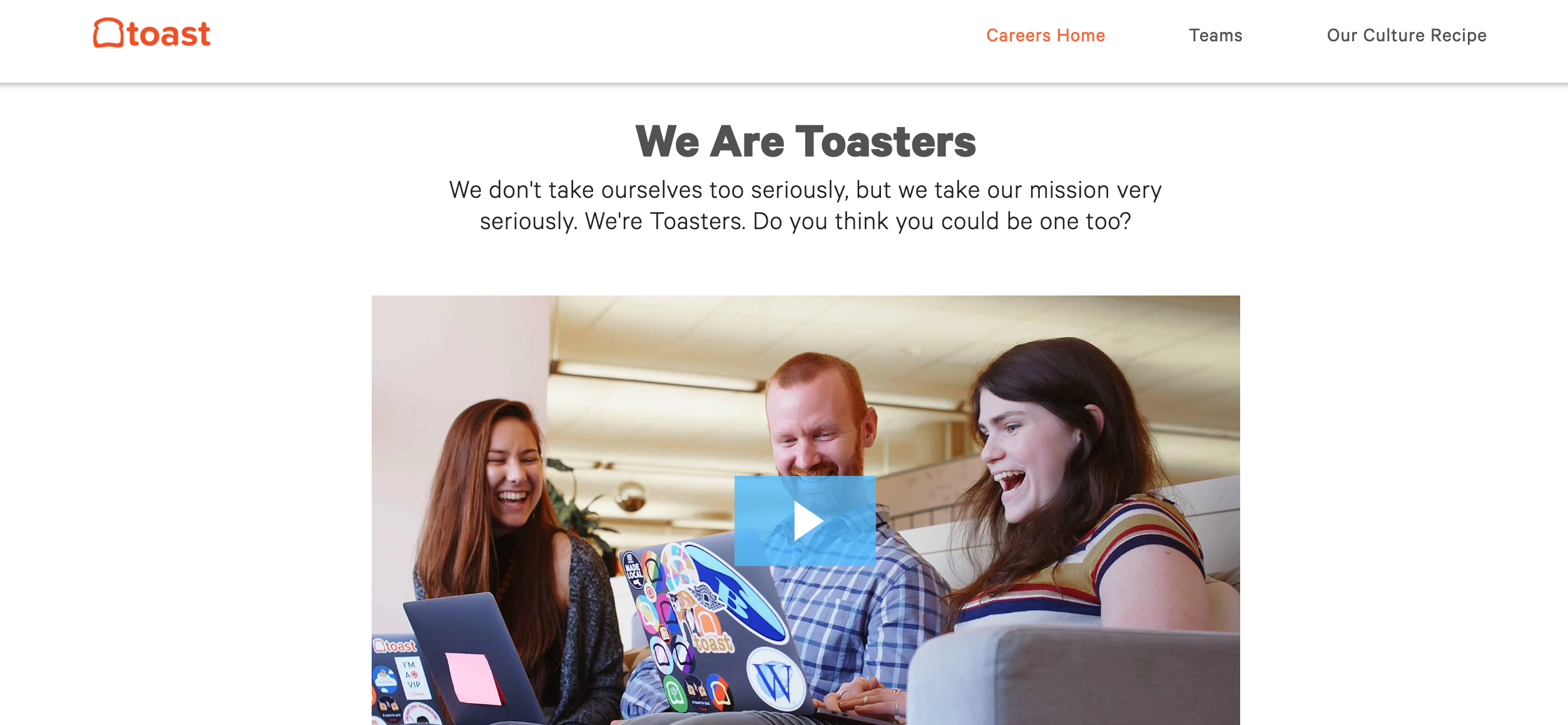
Toast, a cloud-based restaurant software company, uses their career page to show their sense of humor and company culture. They took their name and created a narrative of food-fueled jokes, like their ERGs named “Complex Carbs” and “Multigrain.” Their recruiting video placed prominently at the top of the page highlights the atmosphere in the office and a wide array of employee perspectives from sales managers to product analysts. Having multiple employee testimonials across teams gives prospective candidates a better chance of feeling like they’ll fit somewhere in the mix. Toast’s outline of company values titled “Our Recipe For Success” shows cultural aspects that are usually important to early career candidates such as honesty, transparency, teamwork, and how every individual has an impact. On their campus page they also emphasize how interns and recent grads are treated just like any other employee, which shows prospective candidates that they’ll be valued on the Toast team.
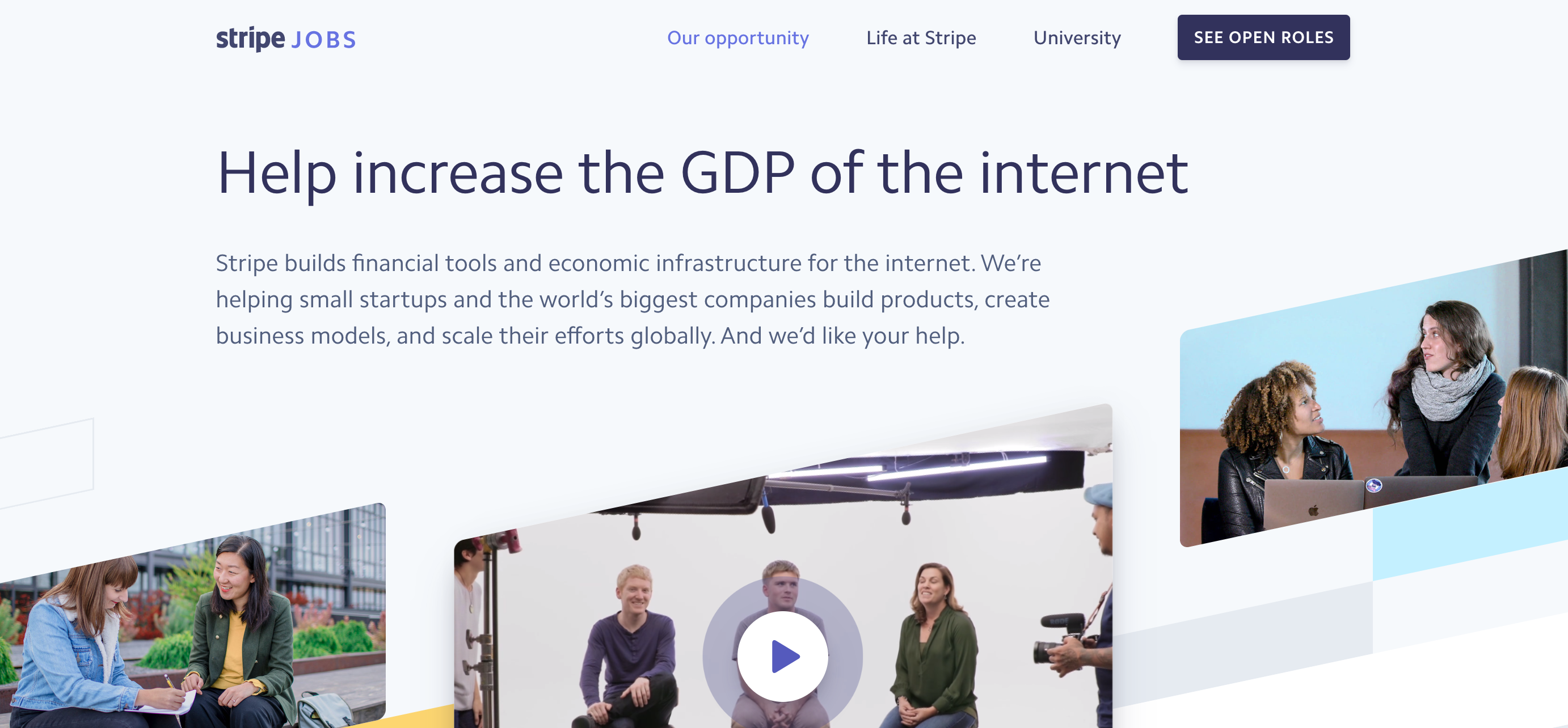
This payment processing software company takes a different approach to their careers page by highlighting what media outlets have reported about them while explaining who they are and what they stand for. Stripe takes this authentic approach to employer branding even further by explaining their current challenges are as an organization, as well as featuring their internal employee reviews on things like feedback, transparency, and employee belief in the company itself. They finish off their page by emphasizing how they would love to talk with any candidates who believe they could be a fit for the company, and also offer to recommend positions to those who aren’t sure what role fits their skillset best. The combination of transparency and frankness contributes to an intriguing – but welcoming – careers page.
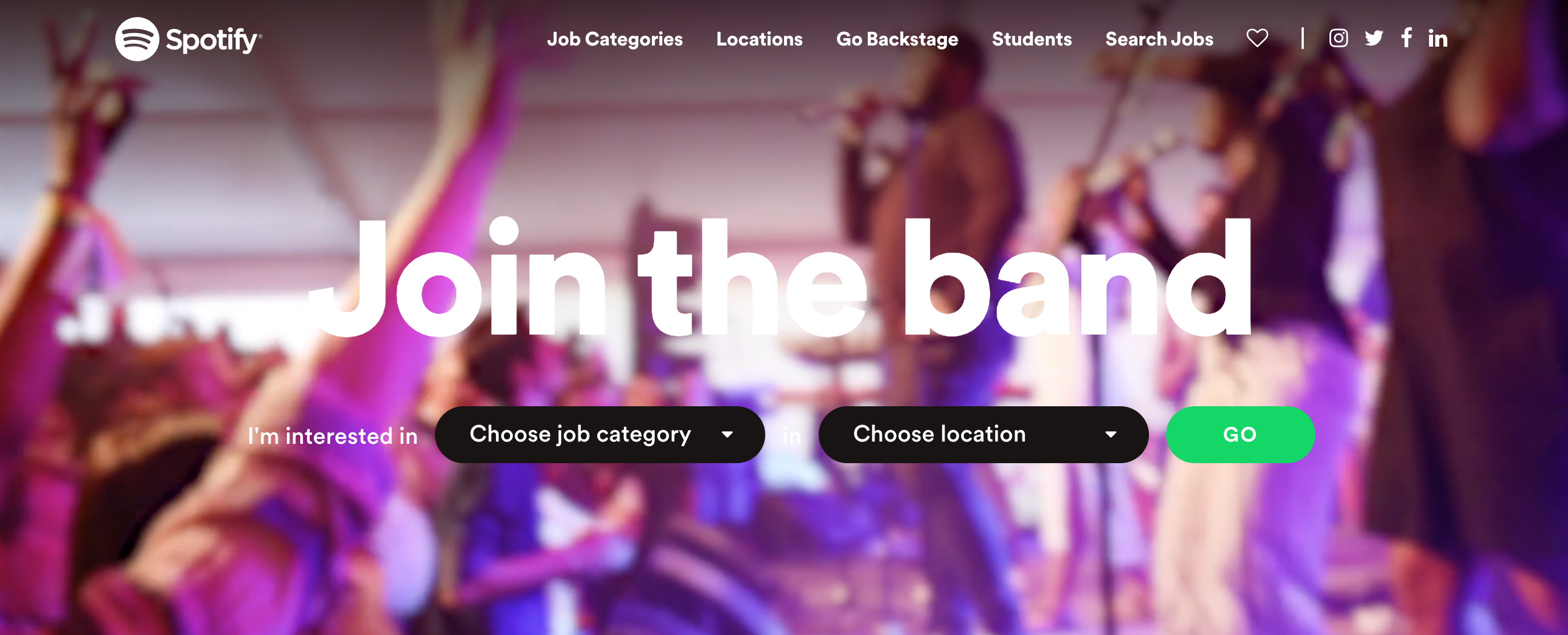
The music streaming service stays on brand with their career page by encouraging candidates to “Join the band” – and gives prospective candidates the chance to explore opportunities right from the start. Candidates can enter their location and preferred job category to get straight to relevant results, or can scroll down to find relevant opportunities by answering the question, “What’s your passion?” Even with the simple interface of the page, Spotify gives candidates the chance to gain an insight into how things run “backstage” through various blog posts and podcast episodes. This behind the scenes view of the company not only highlights company culture and different employee perks, but also gives researching candidates an up-to-date look at company activities.
Their early-career page emphasizes how interns and entry-level employees don’t just do small tasks around the office, but they contribute to the team like any other employee and are part of big projects. They also allow students to enter their info into a database where Spotify management could pull their name for future opportunities, creating an ongoing relationship.
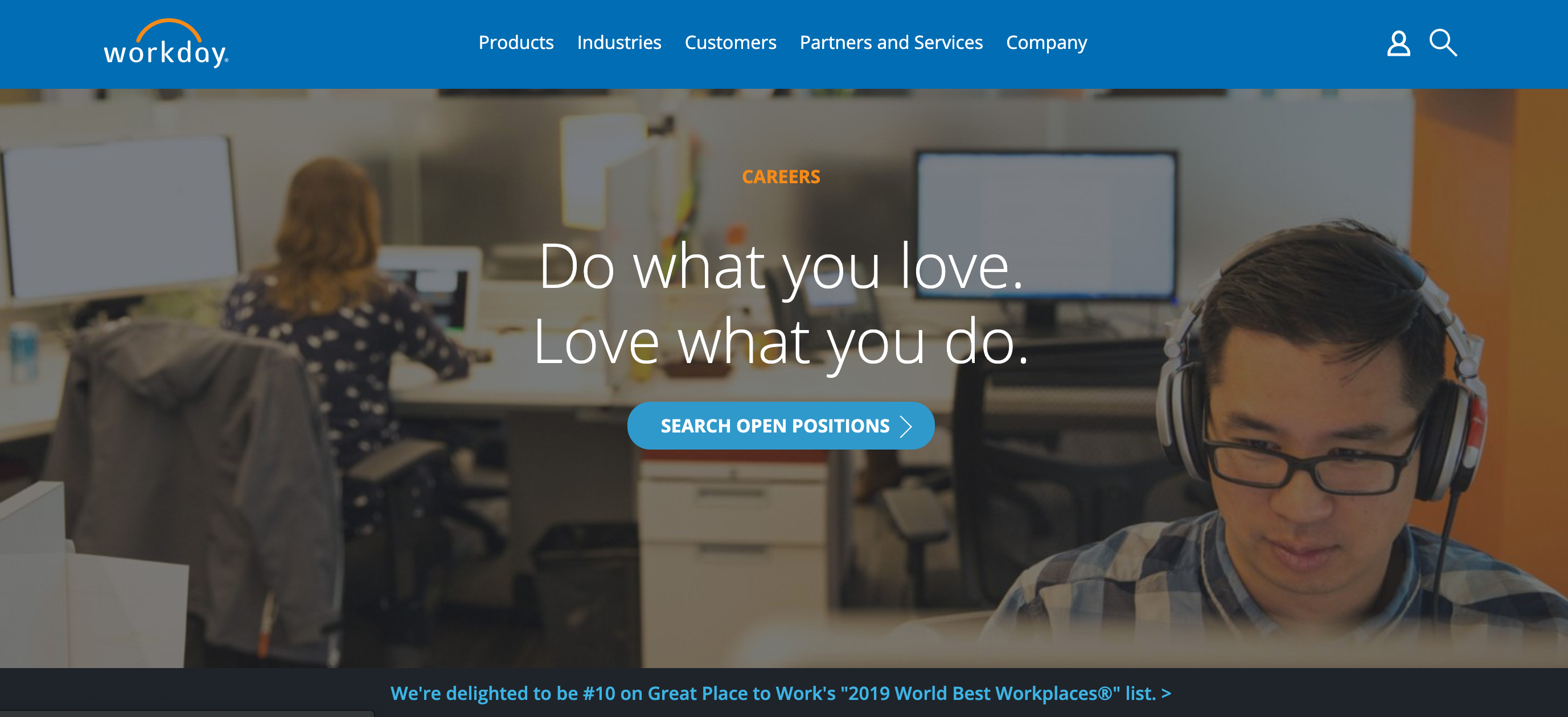
This employee system company stays true to the company’s mission throughout their careers page. As a company that focuses on keeping employees happy for their clients, they show they prioritize this within their own organization by highlighting accolades they’ve received like #10 on the Great Place to Work list. On Workday’s university recruiting page they emphasize how they’ve been voted one of the best places to work for millenials and feature a blog post about why they were named a top workplace for recent grads by Fortune. Being recognized by numerous outside sources as a great place to work shows they stand behind their company mission, and proves to potential candidates that employees there are happy.
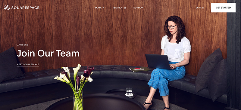
As a company that prides itself on function and design, Squarespace succeeds in having one of the most clear and simple careers pages out there. They make their “about” page easy to navigate and outline the most important facts, accolades, and values of their organization, while the careers section clearly lays out how many open positions are available. The video featured on their careers page has a strong message of innovation, ambitious goals, and successfully conveys their unique company culture and caliber of their employees. Through clean design and compelling visuals, Squarespace stays true to their brand and will stand out to candidates as a result.
Whether you apply one or two new ideas or completely revamp your careers page, you can never go wrong when considering how to improve candidate experience in the information-gathering stages of the hiring process. Here’s to more innovative and informative career pages in 2020.


